Floating Groups in Bubble.io are among the basic container element categories along with regular groups, repeating groups and the other specialised group types. Groups – no matter what type – are used to contain other elements and build a hierarchy on your page that makes up your page design.
Let’s set up a quick example to illustrate what we mean by hierarchy:
Imagine that you set up a completely empty page in your Bubble app. On that blank canvas, you place a group (it doesn’t matter what type). Within that group, you place a text element. In this case, you’ll have a simple hierarchy that looks like this:
- Page
- Group
- Text element
- Group
This is how web pages are built in general – not just in Bubble. Everything is in a hierarchical structure with the page at the bottom and containers (groups) that contain all other elements (like text, buttons, images and input fields).
Ok, with that quick lesson out of the way, let’s see what makes the Floating group special.
What are Floating Groups in Bubble?
The name gives us a hint: Floating Groups… well… float. If you imagine your page hierarchy as a 3-dimensional collection of layers, then the Floating Groups hovers on top of everything else. The only element that is above it on the standard settings is the Popup group, which will always be displayed on top of everything else.
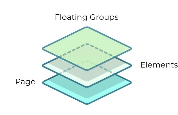
The second interesting feature that the Floating Group gives us is to attach itself to one of the four sides of the screen and remain there even as the User scrolls. This is useful for different scenarios such as:
Top navigation bars
By placing a Floating Group at the top of the screen and attaching it to the top, you can get the typical navigation bar that most websites and web applications use.

Left-hand menus
The same principle applies to a menu that you’ll wish to remain static on the left-hand side of the screen. By attaching it to the top left, you can scroll the rest of the page while the menu remains in place.
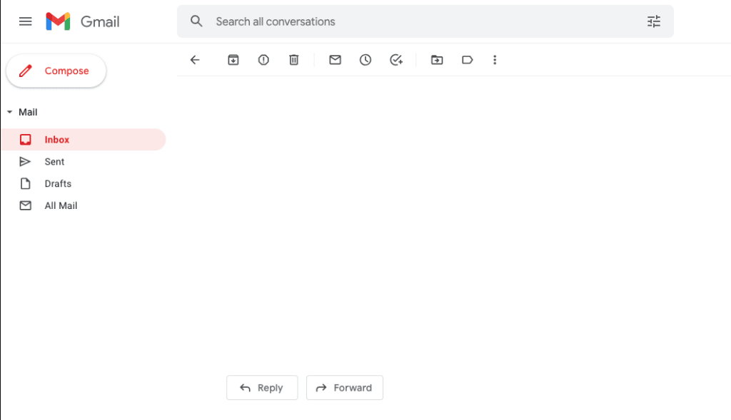
Buttons in the bottom corner
Another typical design choice is to place buttons in the bottom right corner of the screen. These are typically a + symbol to create something, or buttons like Create, Save and Publish. Again you can have these buttons remain in place while the User scrolls the rest of the page to their heart’s content.
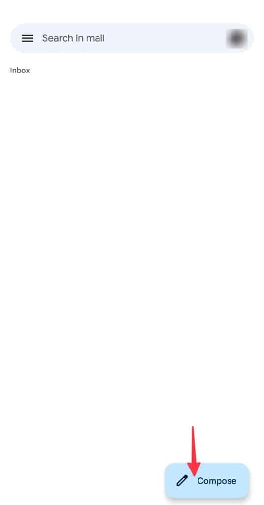
Attaching Floating Groups to the screen borders
As mentioned above, Floating Groups have the ability to attach themselves to two of the screen’s edges, such as the top and left. This doesn’t mean that they have to remain squeezed into the upper left corner though – you can assign any pixel value to create a distance between the X and Y edge and remain consistently at that position as the User scrolls. Using the examples from above, a top or left navigation bar would typically have a 0 pixel distance to the edge, while a button in the lower right corner would have some distance from the corner.
Covering other elements
What you’ll need to be careful about with Floating Groups is that their background (even if transparent) will cover other elements. In other words, elements underneath the Floating Group will not be clickable, since you’re technically clicking the Floating Group itself.
This is why, when you place your Floating Groups on the page, you should not set up the group any bigger than it needs to be to contain its Elements, and if you are distancing it from the edge, it should be the Floating Group itself that is positioned correctly, rather than the Elements within. This way, you avoid having areas of the screen that are not clickable.
Floating Group settings
Vertically float relative to
The vertical value determines how the Group floats on the Y-axis (up/down). You can attach this to the top, bottom, both or none.
Attach to both
If you attach the Floating Group to both top and bottom, the distance to both edges will remain the same. If the Group is too small to show all of its content, it will still attempt to keep a constant distance to both the top and the bottom. In other words, to maintain that distance, the group will not resize to fit the content – it it contains more than it has space for, it will display a scrollbar.
Attach to none
With this setting, the Floating Groups scrolling behavior will be the same as a regular Group: it will scroll along with everything else. The Floating Group will still be above other elements on the Z-axis (we’ll get back to this later in the article).
Horizontally float relative to
Horizontally you can place an element relative to the left or the right edge to maintain a constant distance.
Floating zindex: What is the z-index?
Most people see a website as a 2-dimensional surface where shapes, text and images are «printed» on the screen. But your browser doesn’t actually see it that way: since elements can overlap each other (like a Floating Group that hovers above the rest of the page content), your browser actually needs to understand the page as a 3-dimensional structure.

On a 2-dimensional structure you have the X-axis (sideways) and the Y-axis (up/down) and the depth axis is what’s known as the Z-axis. In traditional web design, the order of the elements in the depth hierarchy (which element is on top of another element) is set by a value called the Z-index. In Bubble this value is mostly invisible to you as a developer, since the order of the elements is controlled visually in the design editor and element tree.
Z-index on Floating Groups
In Bubble’s Element Inspector for the Floating Groups is one of the few places that the Z-index is mentioned. The setting still serves only one purpose with two options: you can choose to place the Floating Group on top of the page (and its elements), or you can place it beneath the page.
If you choose to place it beneath the page, you’ll need to think of the page as any other element: it overlaps the Floating Group, meaning that if the page itself has a background color or image, it will cover the Floating Group.


1 Comment
This is a great explanation. Especially the attach to none – I hadn’t understood exactly what this was about but it is awesome to know that it makes it so the floating group will stay the same height and if its elements are too large they will scroll within the floating group!